S1E3 - Styling Mark Properties (pt1)
Take chart customisation one gigantic step forward. Today’s walk-through looks at styling your chart elements to create truly compelling visualisations 🕊️🧙🏼♂️✨


💌
PBIXfile available at the end of the article 1 Enjoy!
Recap
So far in Episodes 1 and 2, we have looked at the fundamentals of Deneb / Vega-Lite visualisation: how to create a chart using a variety marks, and how to bind our data fields to the a chart’s encoding channel. In this episode, we are going to get jazzy 🎸… I hope you like curly brackets {} 😋
. . .
Understanding Mark Properties
Mark properties are essential for defining how your data viz will appear on your report canvas. As we have demonstrated in earlier episodes, Vega-Lite charts are a combination of one or more marks. This is already an extremely powerful tool in story-telling. The choice of mark type and its properties can be utilised to directly influence the readability, accessability, dynamics and aesthetics of your visualisation.
The joy of Power BI is that we can see what stylistic options are available in the formatting pane, and it is effortless (cough🤫) to find and adjust these options to the desired effect.

Vega-Lite has a plethora of mark properties we can use to manipulate the style of our data viz. However, it is not immediately apparent how or where we can do this. You will be pleased to know that there is no clicky-clacky-draggy-droppy functionality here, instead you have the joy of reading through documentation — reems and reems of lovely, coherent, documentation 🤮🥹.

At this juncture you may be regretting your life choices. It happens to all of us. The pain is temporary. Take a break, wipe away the tears… and when you return with renewed vigour, we will build our formatted viz together. Let’s go!
. . .
Walkthrough: Formatting Mark Properties
Step 1: Prepare the canvas
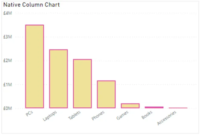
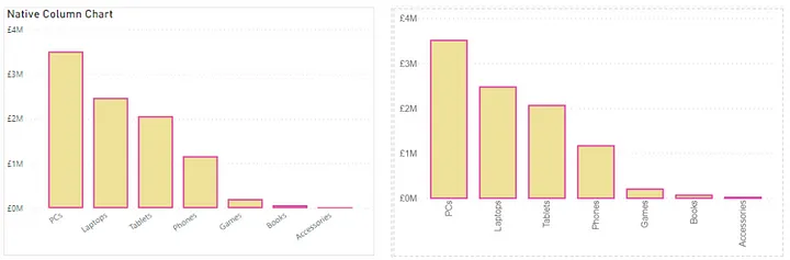
For this exercise, we are going to try and recreate native Power BI visuals in Deneb, let’s start with the column chart:
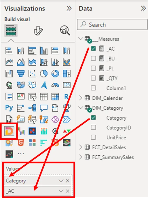
Add a blank Deneb viz to your page, and the DIM_Category[Category] field and ___Measures[**_AC**] measure to the Values field well.
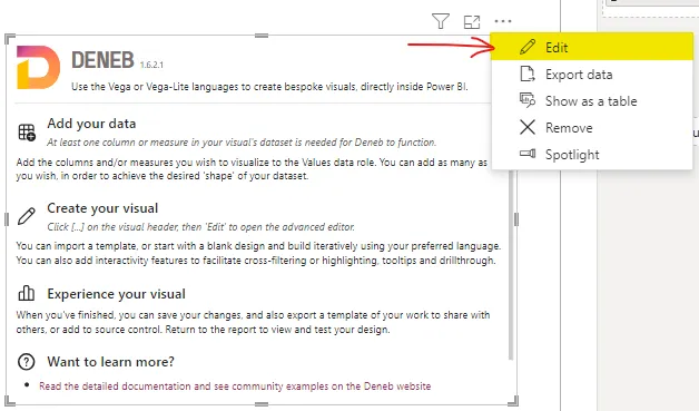
Click on “Edit” and create with “Vega-Lite” and the “Simple bar chart” template.

Step 2: Change bar chart to column chart
The simple bar chart template is a quick way to get the core attributes down so we can start visualisation our development. You will see the mark property and encoding channels already coded.
1
2
3
4
5
6
7
8
9
10
11
12
13
14
{
  "data": {"name": "dataset"},
  "mark": {"type": "bar"},
  "encoding": {
    "y": {
      "field": "Category",
      "type": "nominal"
    },
    "x": {
      "field": "_AC",
      "type": "quantitative"
    }
  }
}
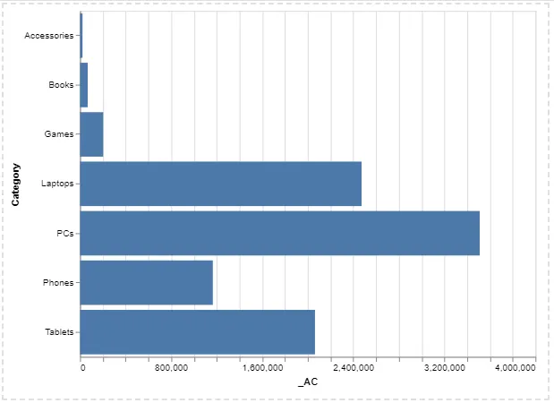
To obtain the requisite column chart, we want the [Category] field to run horizontally across the x-axis, and the [AC] measure to run vertically across the y-axis. So we will simply switch the x and y encoding around.
1
2
3
4
5
6
7
8
9
10
11
12
13
14
{
  "data": {"name": "dataset"},
  "mark": {"type": "bar"},
  "encoding": {
    "x": {                    // change from "y" to "x"
      "field": "Category",
      "type": "nominal"
    },
    "y": {                    // change from "x" to "y"
      "field": "_AC",
      "type": "quantitative"
    }
  }
}
Step 3: Sort the axis
We want the chart to be sorted by the [AC] measure, highest to lowest. Only one little line of code is required…
1
2
3
4
5
6
7
8
9
10
11
12
13
14
15
16
17

{
  "data": {"name": "dataset"},
  "mark": {"type": "bar"},
  "encoding": {
    "x": {
      "field": "Category",
      "type": "nominal",
      "sort": "-y"       // <-- sort the X-axis by the Y-axis (descending)
    },
    "y": {
      "field": "_AC",
      "type": "quantitative"
    }
  }
}
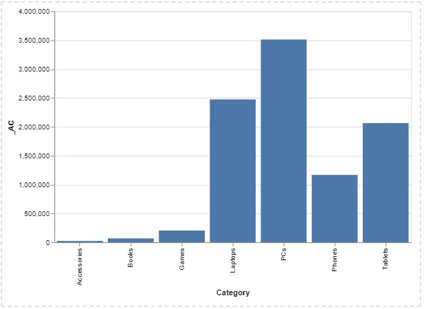
Looking good! That was the easier part 😋 …. time to raise our game and add some colour!
Step 4: Formatting mark colours
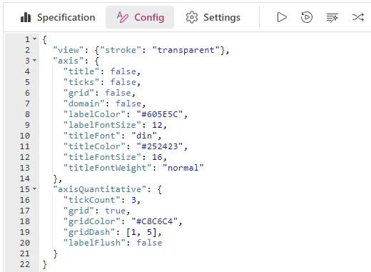
This is most definitely the fun part, you will soon realise that you possess significant creative skill in modifying your chart. Before we touch on this topic, we need to copy and paste a little ‘cheat code’ in Deneb’s Config tab — it’s just so we can apply some global formatting settings to make the chart canvas look more similar to Power BI’s default theming. We’ll revisit this topic in a future episode 🧙♂️
1
2
3
4
5
6
7
8
9
10
11
12
13
14
15
16
17
18
19
20
21
22
{
  "view": {"stroke": "transparent"},
  "axis": {
    "title": false,
    "ticks": false,
    "grid": false,
    "domain": false,
    "labelColor": "#605E5C",
    "labelFontSize": 12,
    "titleFont": "din",
    "titleColor": "#252423",
    "titleFontSize": 16,
    "titleFontWeight": "normal"
  },
  "axisQuantitative": {
    "tickCount": 3,
    "grid": true,
    "gridColor": "#C8C6C4",
    "gridDash": [1, 5],
    "labelFlush": false
  }
}
Now for the colour formatting, returning to the Specification tab, let’s look at the mark property in more detail. I’d like us to compare the difference between using a mark in it’s default form, and accessing a marks properties to adjust specific elements.
1
2
3
4
5
6
7
8
9
10
11
12
13
14
{
  "data": {"name": "dataset"},
// observe the two varieties below
  "mark": "bar",            // <-- default mark, no properties {}
  "mark": {"type": "bar"},  /* <-- enclosing in curly brackets {}
                            allows us to modify the different
                            properties within the mark object
                            */

  "encoding": {
    "x": {...},
    "y": {...}
  }
}
With this understanding, we can now modify the mark’s color properties :(please note - Vega-Lite uses American spelling conventions only)

1
2
3
4
5
6
7
8
9
10
11
{
  "data": {"name": "dataset"},
  "mark": {
    "type": "bar",
    "color": "yellow"    // <-- colour = "yellow"
  },
  "encoding": {
    "x": {...},
    "y": {...}
  }
}
And the result…
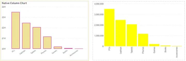
Hmmn, not quite the same colour. I was being lazy by using CSS Colour Names. I need to be more precise, so I will use hex codes to choose:
1
2
3
4
5
6
7
8
9
10
11
12
13
{
  "data": {"name": "dataset"},
  "mark": {
    "type": "bar",
    "color": "#F0E199"    /* <-- this colour is officially "vanilla"
                                 - no really :P
                          */
  },
  "encoding": {
    "x": {...},
    "y": {...}
  }
}
Much much better. Now, just to throw in some confusion there are two ways to adjust colour in a bar mark, using color or fill. What does the official documentation say?

Erm..okay..I think 🤔. Let’s give it a try:
1
2
3
4
5
6
7
8
9
10
11
12
{
  "data": {"name": "dataset"},
  "mark": {
    "type": "bar",
    "color": "yellow",  // <-- original colour choice
    "fill": "#F0E199"   // <-- new "fill" that overwrites "color" attribute
  },
  "encoding": {
    "x": {...},
    "y": {...}
  }
}
We get the same result, the “color”: “yellow” attribute no has power here 😏
Step 5: Adjust the borders aka stroke
Now onto the next challenge. We want to change the outline of our columns. Until recently, it was not possible to do this in Power BI natively, but now this magic is generally available (GA) 🪄.
In Power BI, the outline is referred to as the Border. Whereas in Vega-Lite, this is referred to as the stroke attribute:

Here’s what it looks like in our code:
1
2
3
4
5
6
7
8
9
10
11
12
13
{
  "data": {"name": "dataset"},
  "mark": {
    "type": "bar",
    "color": "yellow",
    "fill": "#F0E199",
    "stroke": "#E044A7"   // <-- stroke colour (pink-ish)
  },
  "encoding": {
    "x": {...},
    "y": {...}
  }
}
Nice! 🙌. Now, we want this to be as identical as possible to the PBI native viz. It looks like the Deneb viz stroke thickness could increased a little. Let’s adjust the stroke style by adding the strokeWidth property:
1
2
3
4
5
6
7
8
9
10
11
12
13
14
15
16

{
  "data": {"name": "dataset"},
  "mark": {
    "type": "bar",
    "color": "yellow",
    "fill": "#F0E199",
    "stroke": "#E044A7",
    "strokeWidth": 2    // <-- stroke width 2px (pixels) wide
  },
  "encoding": {
    "x": {...},
    "y": {...}
  }
}
So satisfying. We are getting closer… just a few more tweaks. Stay with me… we’ve got this!
Step 6: Adjust space between columns
Difficulty level have just increased ↗ and so has the recompense and reward. At this stage, it’s important to reiterate just how powerful and versatile Vega-Lite is. There are multiple ways to achieve the desired effects. Let’s look at a several ways to increase the space between columns:
Method 1: Mark Width (simplest)
1
2
3
4
5
6
7
8
9
10
11
12
13
14
15
{
  "data": {"name": "dataset"},
  "mark": {
    "type": "bar",
    "color": "yellow",
    "fill": "#F0E199",
    "stroke": "#E044A7",
    "strokeWidth": 2,
    "width": 49          // <-- mark width 49px
  },
  "encoding": {
    "x": {...},
    "y": {...}
  }
}
Method 2: X-Mark Bandwidth (complex)
1
2
3
4
5
6
7
8
9
10
11
12
13
14
15
16
17
{
  "data": {"name": "dataset"},
  "mark": {
    "type": "bar",
    "color": "yellow",
    "fill": "#F0E199",
    "stroke": "#E044A7",
    "strokeWidth": 2,
    "width": {
      "expr": "bandwidth('x') * 0.85"    // <-- canvas bandwidth multiplied by 0.85
    }
  },
  "encoding": {
    "x": {...},
    "y": {...}
  }
}
Method 3: X-Axis Scale Padding (more complex)
1
2
3
4
5
6
7
8
9
10
11
12
13
14
15
16
17
18
19
20
21
22
23
24
25
26
27

{
  "data": {"name": "dataset"},
  "mark": {
    "type": "bar",
    "color": "yellow",
    "fill": "#F0E199",
    "stroke": "#E044A7",
    "strokeWidth": 2

  },
  "encoding": {
    "x": {
      "field": "Category",
      "type": "nominal",
      "sort": "-y",
      "scale": {            // open scale property
        "padding": 0.26        // set padding as a decimal (between [0,1]
      }                     // close scale property
    },
    "y": {
      "field": "_AC",
      "type": "quantitative"
    }
  }
}
Method 4: X-Axis Scale Inner Padding (more complex)
1
2
3
4
5
6
7
8
9
10
11
12
13
14
15
16
17
18
19
20
21
22
23
24
25
{
  "data": {"name": "dataset"},
  "mark": {
    "type": "bar",
    "color": "yellow",
    "fill": "#F0E199",
    "stroke": "#E044A7",
    "strokeWidth": 2

  },
  "encoding": {
    "x": {
      "field": "Category",
      "type": "nominal",
      "sort": "-y",
      "scale": {            // open scale property
        "paddingInner": 0.26        // set inner padding as a decimal
      }                     // close scale property
    },
    "y": {
      "field": "_AC",
      "type": "quantitative"
    }
  }
}
Step 7 (final): Format Axis Lables
Last but not least, for the ultimate perfection, let’s tidy up and format the axes labels. This is extra work, but as I’ve said before, the reward is worth it.
Muster the Rohirrim! 🦄
I’ll start with the hardest first, the Y-axis. We’d like to abbreviate the values to millions (M), and add the currency symbol £ (GBP). It’s important to note here that axis lables are not part of the mark property, rather the encoding channel, so the focus of our coding will be here. We are going to harness the beautiful synergy that Deneb provides bringing together the best of both PowerBI and Vega-Lite:
1
2
3
4
5
6
7
8
9
10
11
12
13
14
15
{
  "data": {"name": "dataset"},
  "mark": {...},
  "encoding": {
    "x": {..},
    "y": {                       // y-axis encoding channel
      "field": "_AC",
      "type": "quantitative",
      "axis": {                  // open the axis properties
        "format": "£0,,.#M",       // <-- apply powerbi-style formatting
        "formatType": "pbiFormat"  // <-- activate powerbi formating type
      }                          // close the axis properties
    }
  }
}
If you enjoy pain, you can also apply Vega-Lite’s native D3 number formating — enjoy the documentation 🤓. The downside is that the currency formatting uses the dollar ($) symbol by default
1
2
3
4
5
6
7
8
9
10
11
12
13
14
15
16

{
  "data": {"name": "dataset"},
  "mark": {...},
  "encoding": {
    "x": {..},
    "y": {                       // y-axis encoding channel
      "field": "_AC",
      "type": "quantitative",
      "axis": {
        "format": "$.1s"          // <-- apply currency formatted to 1 significant number
      }                         // close the axis properties
    }
  }
}
And for the final cherry on top 🍒 we are going to adjust the angle of the X-axis labels… something you can’t do in Power BI 🤓
1
2
3
4
5
6
7
8
9
10
11
12
13
14
15
16
17
18
19
20
21
22
23
24
25

{
  "data": {"name": "dataset"},
  "mark": {...},
  "encoding": {
    "x": {
      "field": "Category",
      "type": "nominal",
      "sort": "-y",
      "scale": {"padding": 0.26},
      "axis": {          // open axis properties
        "labelAngle": 325, // <-- adjust label angle
        "labelPadding": 4  // <-- adjust space between labels and bar chart
      }                  // close axis properties
    },
    "y": {
      "field": "_AC",
      "type": "quantitative",
      "axis": {
        "format": "£0,,.#M",
        "formatType": "pbiFormat"
      }
    }
  }
}
BEHOLD! Your Deneb / Vega-Lite column chart that is just as good if not BETTER than the Power BI standard visual… bask in that ambience!
. . .
En Fin, Serafin
Thank you for staying to the end of the article… I hope you find it useful 😊. See you soon, and remember… #StayQueryous!🧙♂️🪄
PBIX 💾
🔗 Repo: Github Repo PBIX Treasure Trove

. . .
Footnotes
_
PBIX: Repo - Walkthrough Series ↩︎