S2E1 - Interactive Lines (Highlight on Hover)
Demystify Vega-Lite Examples in this step-by-step rebuild 🕊️🧙🏼♂️✨

💌
PBIXfile available at the end of the article 1 Enjoy!
Intro
Welcome to Season 2 of the Vega-Lite walkthrough series. In this season, we will go step-by-step through many of the Vega-Lite Examples - learning loads of techniques and tips along the way. Enjoy and welcome! 🕊️
Data
All data used in this series can be found in the Vega github repo:
Official Vega & Vega-Lite Data Source Repo
. . .
Concept
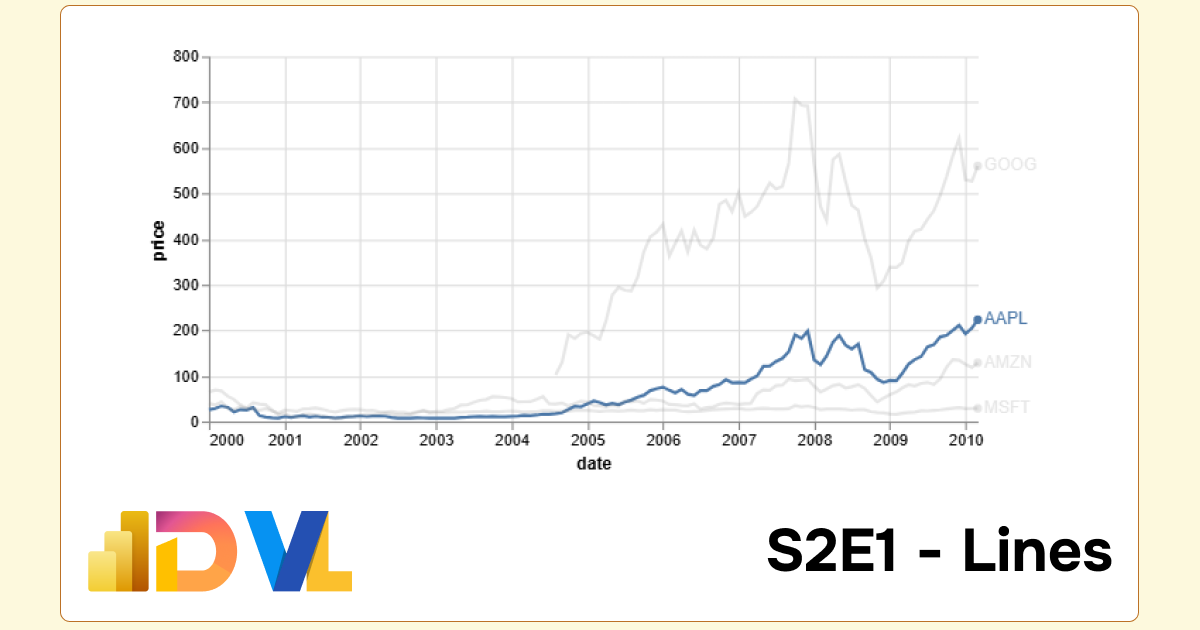
Here is the concept we will rebuild and better understand. The full script can be expanded below.
Important Note: Viewing Vega/Vega-Lite Outputs
When opening in the Vega Online Editor, remember to delete the raw path url before/data/Examples:Github pages:
•"data": {"url": "https://raw.githubusercontent.com/vega/vega/refs/heads/main/docs/data/stocks.csv"}For online editor:
•"data": {"url": "data/stocks.csv}For PowerBI:
•"data": {"name": "dataset"}
Reveal Vega-Lite Spec:
1
2
3
4
5
6
7
8
9
10
11
12
13
14
15
16
17
18
19
20
21
22
23
24
25
26
27
28
29
30
31
32
33
34
35
36
37
38
39
40
41
42
43
44
45
46
47
48
49
50
51
52
53
54
55
56
57
58
{
  "$schema": "https://vega.github.io/schema/vega-lite/v5.json",
  "description": "Multi-series line chart with labels and interactive highlight on hover.  We also set the selection's initial value to provide a better screenshot",
  "width": 600,
  "height": 300,
  /* when opening in the Vega Online Editor, remember to delete the raw path url before /data/ */
  /* • eg: for online editor | "data": {"url": "data/stocks.csv"} */
  /* • eg: for PowerBI | "data": {"name": "dataset"} */
  "data": {"url": "data/stocks.csv"},
  "transform": [{"filter": "datum.symbol!=='IBM'"}],
  "encoding": {
    "x": {"field": "date", "type": "temporal", "title": "date"},
    "y": {"field": "price", "type": "quantitative", "title": "price"},
    "color": {
      "condition": {
        "param": "hover",
        "field":"symbol",
        "type":"nominal",
        "legend": null
      },
      "value": "grey"
    },
    "opacity": {
      "condition": {
        "param": "hover",
        "value": 1
      },
      "value": 0.2
    }
  },
  "layer": [{
    "description": "transparent layer to make it easier to trigger selection",
    "params": [{
      "name": "hover",
      "value": [{"symbol": "AAPL"}],
      "select": {
        "type": "point",
        "fields": ["symbol"],
        "on": "pointerover"
      }
    }],
    "mark": {"type": "line", "strokeWidth": 8, "stroke": "transparent"}
  }, {
    "mark": "line"
  }, {
    "encoding": {
      "x": {"aggregate": "max", "field": "date"},
      "y": {"aggregate": {"argmax": "date"}, "field": "price"}
    },
    "layer": [{
      "mark": {"type": "circle"}
    }, {
      "mark": {"type": "text", "align": "left", "dx": 4},
      "encoding": {"text": {"field":"symbol", "type": "nominal"}}
    }]
  }],
  "config": {"view": {"stroke": null}}
}
. . .
Build
Step 1:
Let’s begin with our basic line.
1
2
3
4
5
6
7
8
9
10
11
{
"data": {"url": "data/stocks.csv"},
"title": "Step 1",
"encoding": {
    "x": {"field": "date", "type": "temporal"},
    "y": {"field": "price", "type": "quantitative", "aggregate": "sum"}
  },
  "layer": [{
      "mark": "line"
    }]
}
Step 2: Add Colour / Legend
We want to create multiple lines, one for each category. In PowerBI, this your category / detail / legend field. In VL, this is produced with the color attribute.
1
+ "color": {"field": "symbol", "type": "nominal"}
1
2
3
4
5
6
7
8
9
10
11
12
13
14
{
  "data": {"url": "data/stocks.csv"},
  "title": "Step 1",
  "encoding": {
    "x": {"field": "date", "type": "temporal"},
    "y": {"field": "price", "type": "quantitative", "aggregate": "sum"},

    /*** add color legend ***/
    "color": {"field": "symbol", "type": "nominal"}
  },
  "layer": [{
      "mark": "line"
    }]
}
Step 3: Conditional Colour
Next, we want to create the interactive hover element. At the moment, it may not seem that the hover aspect works. We have to be very precise with the mouse placement over the desired line. So we will also had an additional later to make the hover more hoverable 🪄.
There are two segments to amend:
- color
- params
We can see the interactive behaviour more explicity by assigning a colour in place of the transparency:
colour
1
2
3
4
5
6
7
8
9
10
11
12
{ ... // add conditional color/legend
    "color": {
      "condition": {    // if symbol field is on hover then 'color'
        "param": "hover",   // invoke hover parameter
        "field":"symbol",   // hover to work on 'symbol' field
        "type":"nominal",
        "legend": null // hide legend element on chart
      },
      "value": "grey" // if symbol field is not on hover then 'grey'
    }
 ...
}
additional mark layer with params
1
2
3
4
5
6
7
8
9
10
11
12
13
14
// add new line layer which binds to the hover parameter
{
      "params": [{
      "name": "hover",
      "value": [{"symbol": "AAPL"}],
      "select": {
        "type": "point",
        "fields": ["symbol"],
        "on": "pointerover"
      }
    }],
    /* additional mark with transparent colour, the strokewidth will determine the mouses hoverable interactive comfort */
      "mark": {"type": "line", "strokeWidth": 8, "stroke": "transparent"}
}
. . .
Step 4: Conditional Opacity
Now that our chart is interactive, we’d like to finesse it further by keeping the highlighted line emphasised and simulataneously increase the transparency of the unselected line. Compare both methods here:
opacity
1
2
3
4
5
6
7
"opacity": {                // opacity attribute
      "condition": {        // condition
        "param": "hover",   // where hover is active
        "value": 1          // then full opacity
      },
      "value": 0.2          // else 0.2 opacity
    }
. . .
Bonus Features
We could leave it there, but not today Satan 😈 - We can beautify our chart further with a few additional elements.
Step 5: Add end point marks
It’s always nice to have marks on the line chart, very minimalist and effect. In order to achieve this we are going to do two things:
- Create a sub
layerin which we will place a newcirclemark - Apply a separate
encodingto this newlayer
The importance of encoding layers
If we were to simply add a new circle mark, by default whatever encoding were have applied globably will bound to our circle mark (see 5a. and 5b. below)
Encoding layers
Notice how in Step 5a., the circle mark is apply to each data point in the line chart. In 5b., we bind the mark to the max data point on the x-axis date field, and the max data points on both the price y-axis AND the max point of the x-axis using argmax
circle mark without encoding
1
2
3
4
5
6
{
"layer": [{
"mark": {"type": "circle"}
}]
// no encoding bindings on this layer
}
circle mark with encoding
1
2
3
4
5
6
7
8
9
10
11
12
{
    "layer": [{
    "mark": {"type": "circle"}
    }],
    "encoding": {
    /* bind the circle mark to the max x-axis data point */
    "x": {"aggregate": "max", "field": "date"},

    /* bind the circle mark to the argmax x-axis and the y-axis price field */
    "y": {"aggregate": {"argmax": "date"}, "field": "price"}
}
}
Step 6: Add end point data labels
Swifter development
Now that we have built the foundation of our chart, correctly layered and encoded, development becomes alot slicker and swifter. Next, we will assign text labels and position them at the end of our each line.
Because we have already bound a sublayer to bind marks agains the max/end points, we can simply add a new mark within this layer.
Additional text mark
**additional text mark within sublayer **
1
2
3
4
5
6
7
8
9
10
11
12
13
14
15
16
17
18
{ ...
"layer": [
    {"mark": {"type": "circle"}},   // previous circle mark
    {
      {
        "type": "text",             // text mark
        "fontSize": 12,             // text font size
        "align": "left",            // aligned to the left
        "dx": 6                     // offset x-axis 4 pixels to the right
        },
      "encoding": {
        "text": {                   // bind the value in the symbol field to the text mark
            "field":"symbol",       // symbol field
            "type": "nominal"
            }
        }
    }]
... }
. . .
En Fin, Serafin
Thank you for staying to the end of the article… I hope you find it useful 😊. See you soon, and remember… #StayQueryous!🧙♂️🪄
PBIX 💾
🔗 Repo: Github Repo PBIX Treasure Trove

. . .
Footnotes
PBIX: Repo - Walkthrough Series ↩︎