S2E2 - Interactive Columns/Bars (Highlight & Select)
Demystify Vega-Lite Examples in this step-by-step rebuild 🕊️🧙🏼♂️✨

💌
PBIXfile available at the end of the article 1 Enjoy!
Intro
Welcome to Season 2 of the Vega-Lite walkthrough series. In this season, we will go step-by-step through many of the Vega-Lite Examples - learning loads of techniques and tips along the way. Enjoy and welcome! 🕊️
Data
All data used in this series can be found in the Vega github repo:
Official Vega & Vega-Lite Data Source Repo
inline dataset
1
2
3
4
5
6
7
8
9
10
11
12
13
"data": {
    "values": [
      {"category": "A", "amount": 28},
      {"category": "B", "amount": 55},
      {"category": "C", "amount": 43},
      {"category": "D", "amount": 91},
      {"category": "E", "amount": 81},
      {"category": "F", "amount": 53},
      {"category": "G", "amount": 19},
      {"category": "H", "amount": 87},
      {"category": "I", "amount": 52}
    ]
  }
. . .
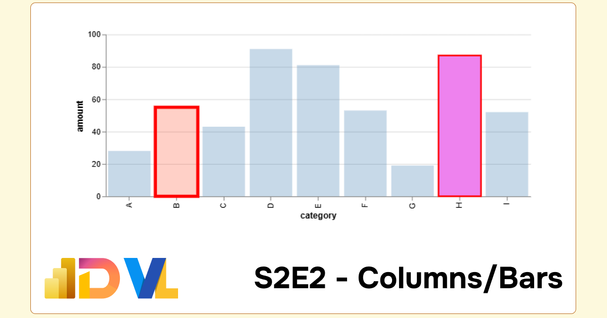
Concept
Here is the concept we will rebuild and better understand. The full script can be expanded below.
Important Note: Viewing Vega/Vega-Lite Outputs
When reference Vega data sources in the Vega Online Editor, remember to delete the raw path url before/data/Examples:Github pages:
•"data": {"url": "https://raw.githubusercontent.com/vega/vega/refs/heads/main/docs/data/stocks.csv"}For online editor:
•"data": {"url": "data/stocks.csv}For PowerBI:
•"data": {"name": "dataset"}
Reveal Vega-Lite Spec:
1
2
3
4
5
6
7
8
9
10
11
12
13
14
15
16
17
18
19
20
21
22
23
24
25
26
27
28
29
30
31
32
33
34
35
36
37
38
39
40
41
42
43
44
45
46
47
48
49
50
51
52
53
54
55
56
57
58
59
60
{
  "$schema": "https://vega.github.io/schema/vega-lite/v5.json",
  "description": "A bar chart with highlighting on hover and selecting on click. (Inspired by Tableau's interaction style.)",
  "data": {
    "values": [
      {"category": "A", "amount": 28},
      {"category": "B", "amount": 55},
      {"category": "C", "amount": 43},
      {"category": "D", "amount": 91},
      {"category": "E", "amount": 81},
      {"category": "F", "amount": 53},
      {"category": "G", "amount": 19},
      {"category": "H", "amount": 87},
      {"category": "I", "amount": 52}
    ]
  },
  "title": "Final Output",
  "params": [
    {
      "name": "highlight_pointer",
      "select": {"type": "point", "on": "pointerover"}
    },
    {"name": "select_pointer", "select": "point"}
  ],
  "mark": {
    "type": "bar",
    "fill": "#4C78A8",
    "stroke": "red",
    "cursor": "pointer"
  },
  "encoding": {
    "x": {"field": "category", "type": "ordinal"},
    "y": {"field": "amount", "type": "quantitative"},
    "fillOpacity": {
      "condition": {"param": "select_pointer", "value": 1},
      "value": 0.3
    },
    "strokeWidth": {
      "condition": [
        {
          "param": "select_pointer",
          "empty": false,
          "value": 2
        },
        {
          "param": "highlight_pointer",
          "empty": false,
          "value": 4
        }
      ],
      "value": 0
    }
  },
  "config": {
    "scale": {
      "bandPaddingInner": 0.2
    }
  }
}
. . .
Build
We begin with the skeleton, the bar mark and encoding:
Step 1: Starting block
Let’s begin with our basic columns.
1
2
3
4
5
6
7
8
9
10
11
12
13
14
15
16
17
18
19
20
21
22
23
24
25
26
27
28
29
{
  "data": {
    "values": [
      {"category": "A", "amount": 28},
      {"category": "B", "amount": 55},
      {"category": "C", "amount": 43},
      {"category": "D", "amount": 91},
      {"category": "E", "amount": 81},
      {"category": "F", "amount": 53},
      {"category": "G", "amount": 19},
      {"category": "H", "amount": 87},
      {"category": "I", "amount": 52}
    ]
  },
  "title": "Step 1",
  "mark": {
    "type": "bar",
    "fill": "#4C78A8"
  },
  "encoding": {
    "x": {"field": "category", "type": "ordinal"},
    "y": {"field": "amount", "type": "quantitative"}
  },
  "config": {
    "scale": {
      "bandPaddingInner": 0.2
    }
  }
}
Step 2: Build Highlight Effect
Now, we need to create a parameter which will allow the chart to ‘respond’ when we hover our mouse over the chart.
Pointer Params
Firstly, we want to ensure that when we do hover over the chart, we want to see a red ‘halo’ effect around each column. We’ll add the stroke attribute, alongwith a cursor attribute.
1
2
3
4
5
6
7
8
9
10
11
12
13
14
15
16
17
18
19
20
21
22
23
24
25
26
27
28
29
30
31
32
{
  "data": {
    "values": [...] // data truncated
  },
  "title": "Step 2",
  /** parameter block **/
  "params": [
    {
      "name": "highlight_pointer",  // parameter name
      "select": {                   // parameter attribute
        "type": "point",            // select type
        "on": "pointerover"         // select behaviour is true on pointerover
      }
    },
    {
      "name": "select_pointer",     // parameter name
      "select": "point"             // parameter attribute
    }
  ],
  /** mark block **/
  "mark": {
    "type": "bar",
    "fill": "#4C78A8",
    "stroke": "red",                // stroke colour
    "cursor": "pointer"             // point curser
  },
  /** encoding block **/
  "encoding": {
    "x": {"field": "category", "type": "ordinal"},
    "y": {"field": "amount", "type": "quantitative"}
  }
}
Step 3: Handle Hover/Point Behaviours
In order for the highlight to be effective, we need to bind our parameters in the encoding block. Before we see what this means or looks like, we should ask ourselves the question:
What element of the chart do I want to change?
We want the bar to have a red halo effect when we pass the mouse cursor over a data point. In our encoding block we can alter the behaviour of the stroke, in particular the strokeWidth:
Params
1
2
3
4
5
6
7
8
9
10
11
12
13
"params": [
    {
      "name": "highlight_pointer",  // parameter name
      "select": {                   // parameter attribute
        "type": "point",            // select type
        "on": "pointerover"         // select behaviour is true on pointerover
      }
    },
    {
      "name": "select_pointer",     // parameter name
      "select": "point"             // parameter attribute
    }
  ]
Encoding
1
2
3
4
5
6
7
8
9
10
11
12
13
14
15
/* encoding block*/
"encoding": {
    "x": {"field": "category", "type": "ordinal"},
    "y": {"field": "amount", "type": "quantitative"},
    "strokeWidth": {   // strokeWidth attribute
      "condition": [
        {
          "param": "highlight_pointer", // when highlight_parameter is 'true'
          "value": 4,                   // then strokeWidth is 4
          "empty": false
        }
      ],
      "value": 0      // otherwise, when not highlighted, strokeWidth is zero (invisible)
    }
  }
Step 4: Handle Click/Select Behaviours
So we’ve covered the behaviours for mouse hover/point. Next we want to be able to ‘select’ a data point. In selecting a data point, we wish to emphasise this data point and fade out the remaining, unselected data points. We shall return to the encoding block. This time, we will alter the behaviour of both the strokeWidth AND the fillOpacity attributes:
fill opacity
1
2
3
4
5
6
7
"fillOpacity": {
      "condition": {    // condition
        "param": "select_pointer", // when the 'select_pointer' parameter is 'true' (data point is selected)
        "value": 1                  // then fill opacity = 1
        },
      "value": 0.3                  // when then selected, then 30% opacity
    }
stroke width
1
2
3
4
5
6
7
8
9
10
11
12
13
14
15
16
/** stroke width **/
    "strokeWidth": {     // strokeWidth attribute
      "condition": [
        {
          "param": "select_pointer",    // when data is selected (when param 'select_pointer' is true)
          "value": 2,                   // then strokeWidth is 2
          "empty": false
        },
        {
          "param": "highlight_pointer", // when highlight_parameter is 'true'
          "value": 4,                   // then strokeWidth is 4
          "empty": false
        }
      ],
      "value": 0   // otherwise, when not highlighted and not selected, strokeWidth is zero (invisible)
    }
. . .
Bonus Features:
Step 5: Change Highlight Colour:
We’ve made great achievements here, but why have cotton when you can have silk? Let’s take the magic to another level. We want to change the colour of the column data point when we hover over it. Can you think what encoding attribute we can alter?
Correct… the fill attribute. No we are beginning to see a pattern, we can copy and paste previous segments and tweek them slightly:
1
2
3
4
5
6
7
8
9
10
11
12
13
14
15
"fill": {                   // fill attribute
      "condition": [                    // condition array in square brackets
        {                               // condition 1
          "param": "highlight_pointer", // if highlight_pointer param is true
          "value": "tomato",            // then fill with tomato colours (tasty)
          "empty": false
        },
        {                               // condition 2
          "param": "select_pointer",    // when select_pointer param is true
          "value": "violet",            // then violet
          "empty": false
        }
      ],
      "value": "steelblue"              // otherwise when conditions are not met, steelblue colour
    }
. . .
En Fin, Serafin
Thank you for staying to the end of the article… I hope you find it useful 😊. See you soon, and remember… #StayQueryous!🧙♂️🪄
PBIX 💾
🔗 Repo: Github Repo PBIX Treasure Trove

. . .
Footnotes
PBIX: Repo - Walkthrough Series ↩︎